About
Blog redesign project which involved redesigning the look, layout and user journey of the in house blog which sits on the Global website for the Company Common Purpose. I was the project lead and this involved working with other key internal stakeholders in the research and testing phases.
My role:
Project lead – in collaboration with the Senior Graphic designer and Web developer.
- Balsamiq
- Illustrator
- Photoshop
Problem
To redesign a new ‘knowledge hub’ blog platform for the global organization Common Purpose, making improvements to the previous version in relation to the user journey, layout and overall UX. The organization need was to create a new look, which entailed strategizing improvements in functionality and the UI; using uniform infographics as thumbnails and allow a very simple user journey with as few clicks as possible, using a initial landing page from the main Navigation.
Design Methodology
1-2-1 interviews with internal stakeholders on usability of the current platform
Plannng the user journey to the blog page; incorporating research feedback
Wireframing the required pages
1. initial landing page
2. blog landing page
3. Blog post page
Implementing the build in collaboration with in-house Javascript developer
AB testing with internal stakeholders.
Research
Key feedback from internal stakeholders included:
“Inconsistency in the thumbnails; a uniform style would be preferred.”
“The look and feel should be slightly different from the main website having its own branding.”
“Post pages should be more interactive with a previous and next button. I also think that related posts would work well to keep users from navigating away.”
“A fresh design – the current version appears dated.”
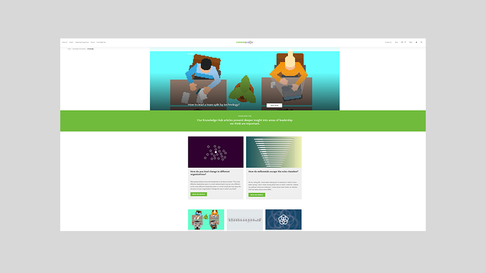
Please see below a screenshot of the old platform which highlights the blog page which has a featured post and the other posts below.
User Personas


Wireframes
After producing sketches and initial research, the key pages were loosely wire-framed using Balsamiq before user interview sessions with the senior management team.
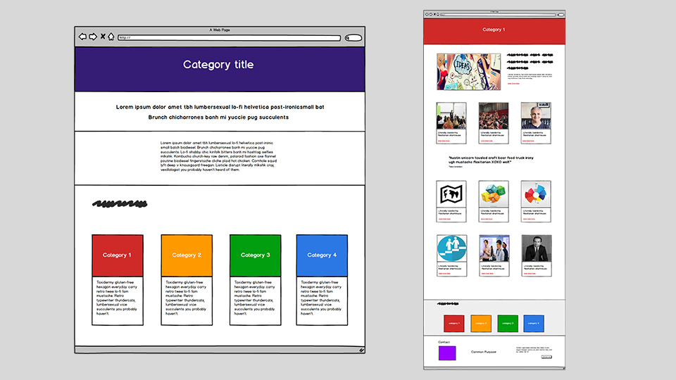
The top level page in the first image was designed to give an introduction of the blog; the concepts and aims. This will have a CTA to the blog itself. The second image shows the blog landing page containing a feature post at the top of the page and all other the other blog posts listed below.
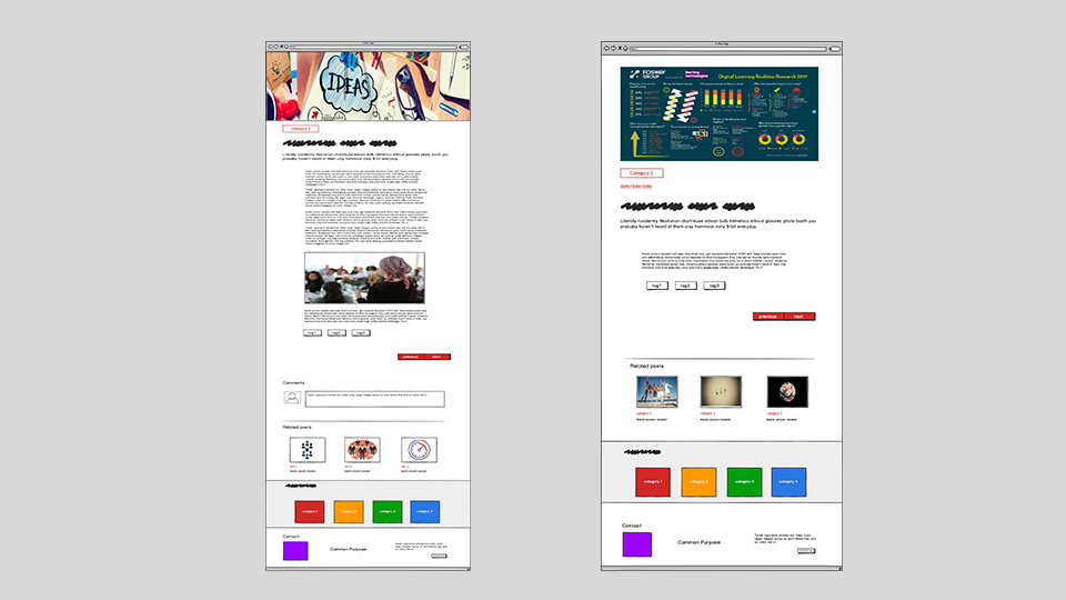
After feedback from the user interviews we brainstormed the idea of having long and short form blog posts; layout would predominantly remain the same.
Key New Features
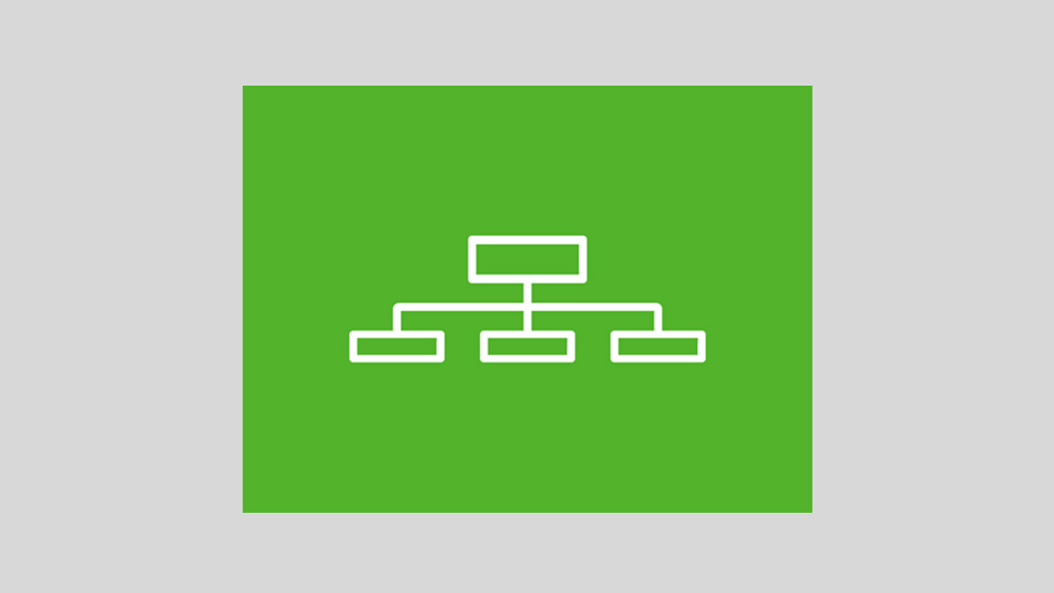
Additional features included a new set of infographics (please see example provided). These will vary in color but create more identity to the blog than the previous version and brand identity which will be replicated on all social media channels. Blog author image, author name and a short bio will also be added within the posts.
Web Development
I worked in collaboration with the in-house Web Developer who framed the design focusing mainly on the Javascript coding and I was required to adapt this through coding the HTML and CSS.
• I collaborated in coding the HTML within the pages to create the key components
• I lead in the CSS coding and structuring the web page features and color coding
• I produced a suite of infographics for the posts in conjunction with the senior Graphic designer
Testing
After framing the initial design this was tested by a number of key stakeholders within Marketing and other teams inthe organization. As a result a number of points were raised
• Removed quotes from the blog landing page; added little value being here
• Removed long/short form posts ; just kept one format
• Add previous/next posts at the top and bottom of the page
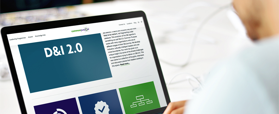
Final Live Project
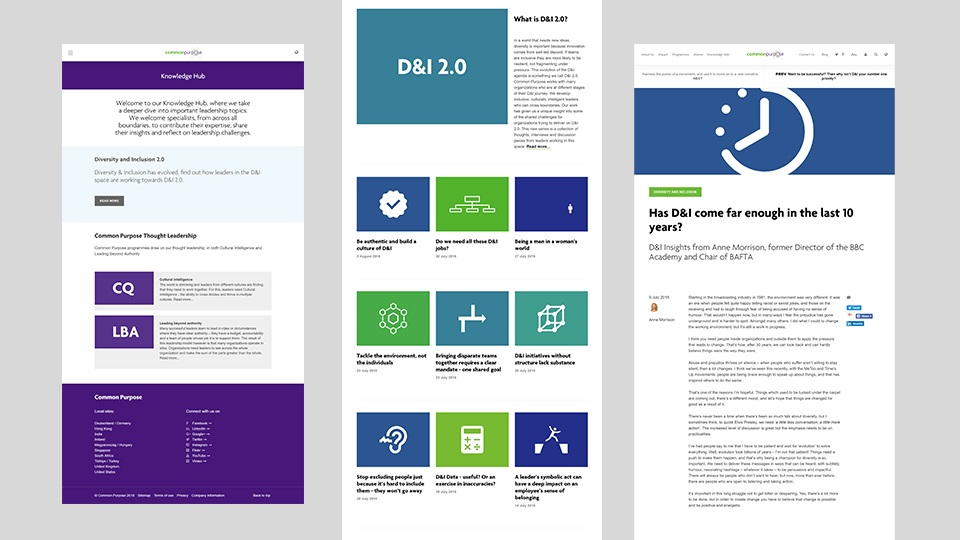
Conclusion
In 2018 the new knowledge hub blog platform was launched by Common Purpose. The new layout was well received both internally and by external stakeholders. Feel free to view the full project by clicking on the image below or the link here


