About Copperberg
A Swedish based organisation operating in the manufacturing sector, creating physical and digital platforms bringing together the manufacturing community in order to grow and build relationships globally.
My role:
Lead Designer
- Sketch
- Illustrator
- Photoshop
- WordPress
Problem
The organisation wanted to develop the old version of the website and produce a brand new platform with a fully functional membership area. The intention was to redesign the look and feel as the UI was essentially dated and not inline with the updated brand color and typography. In addition given the fact that the platform produces daily news content, its UX needed to be improved with content being categorized in a clear format.
IA/User Flow

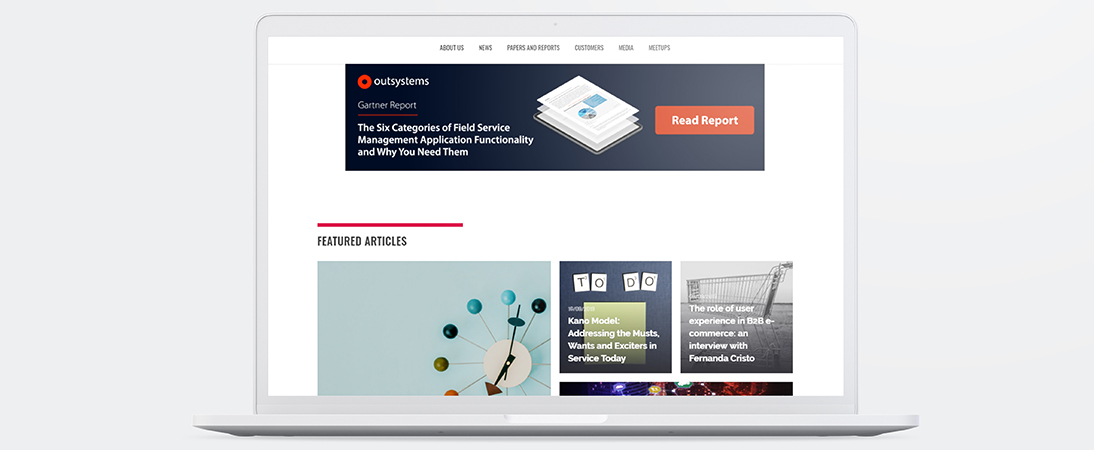
Old version of the website platform
Brand identity remained an issue with the old platform especially considering the UI as it was felt from the management team that there was no clear look and feel which consistently promoted the Copperberg brand. As mentioned previously the news section was a focal point for end users and wasn’t very user friendly, in relation to column layout and access to archived/related news.
User Personas

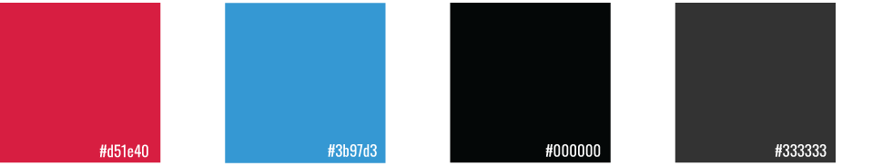
Brand Colors
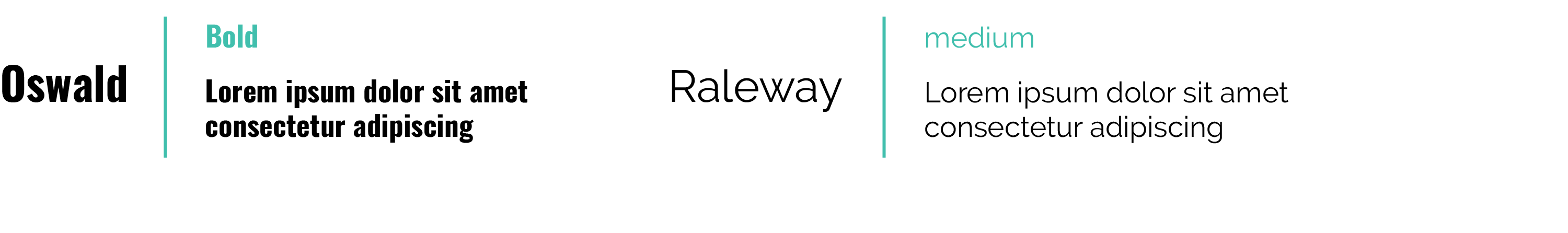
Fonts
Wireframes
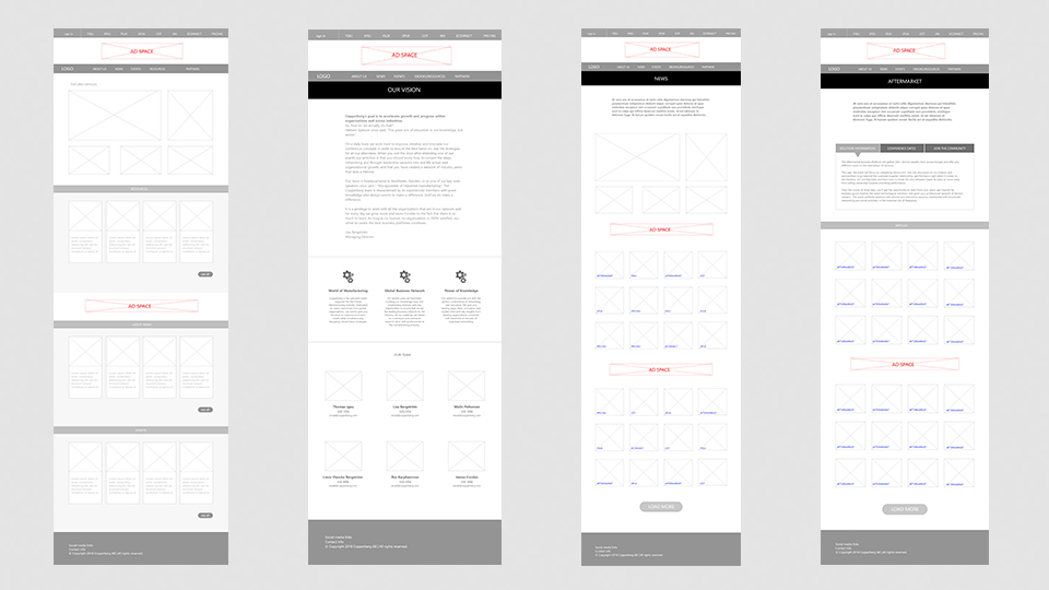
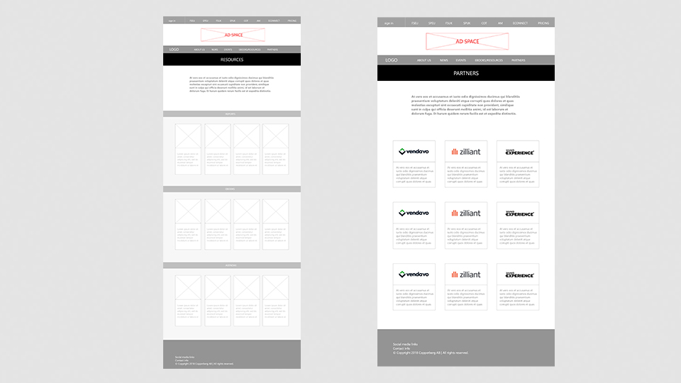
After feedback from initial brainstorming and 2 user interview sessions with the management team comprising of 5 staff members I produced the above wireframes. Key features implemented entailed a brand new layout with boxed thumbnails, having increased spacing between each post. I also aimed to improve the news section into specific categories which linked to the relevant page.
Feedback also mentioned making the website more image focused. My initial thoughts with this was to enhance brand consistency through engaging thumbnails, with more minimal images within the news based pages. Overall feedback from the wireframes were positive, especially in relation the more concise layout.
Final Design
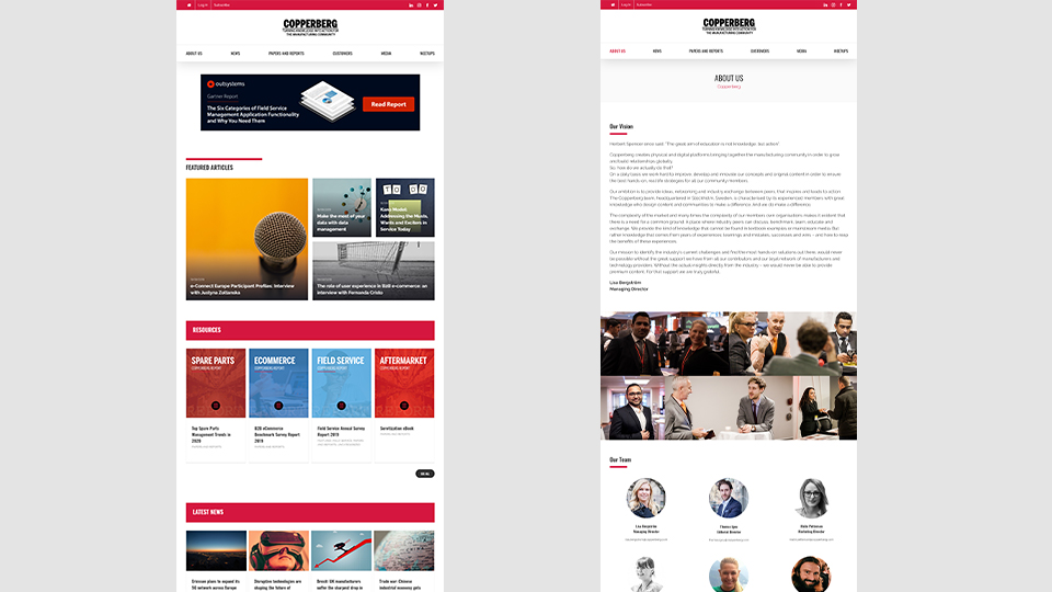
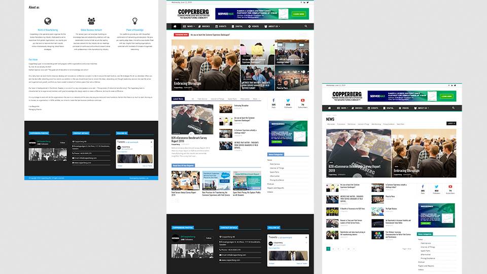
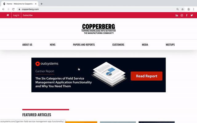
The first image showcases the new homepage layout which concisely presents categorized news article offerings. I centered the Company logo so it remains a clear focal point followed by featured news, resources, latest news, events and partner logos towards the bottom of the page. It was also evident through my research and moodboard that websites with many thumbnails often require a plain background and white spacing to avoid clashing of multiple colors; which is something I achieved.
The About us section is largely text focused, though I added a visual element which was missing from the old website of Hi quality staff photos from events and profiles with contact information.
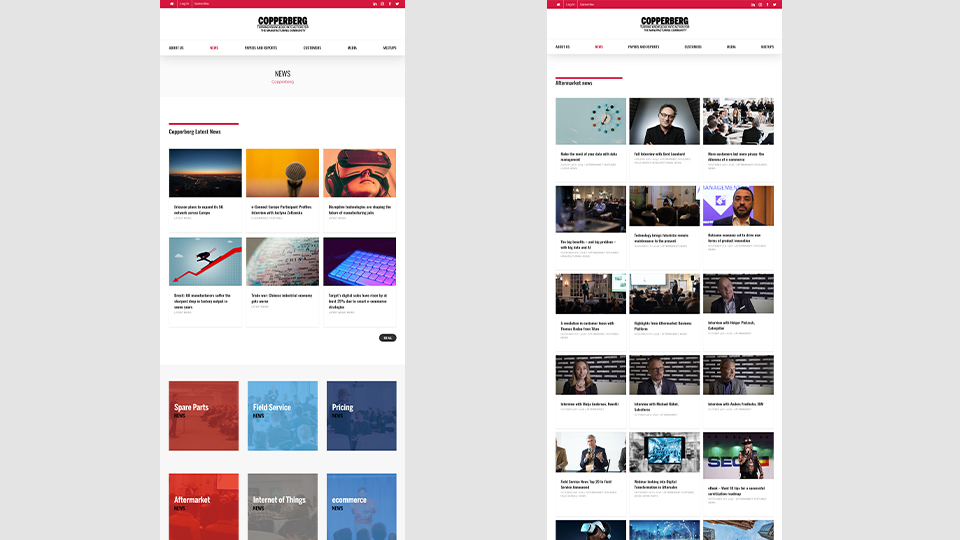
The new platform focused heavily on producing daily articles highlighting trends in the manufacturing space. the first page highlights the latest news followed by the various categories each article will be tagged with dependant on the topic.
For example all new tagged Aftermarket will sit within its own page as can been seen in the second image. the format is very simple and clean with three columns and a load more option after every 21 posts.
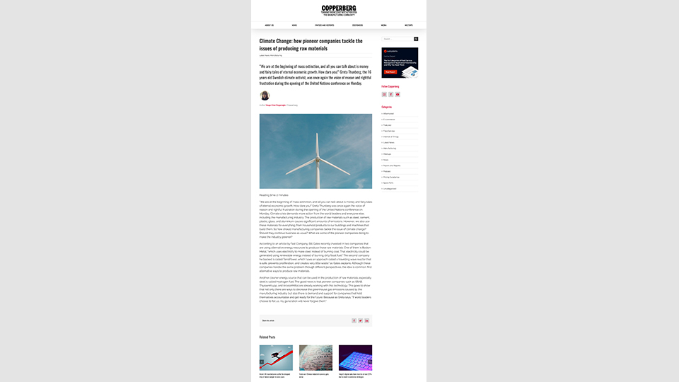
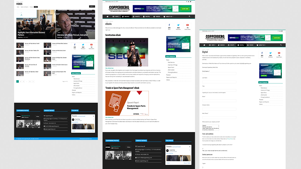
We can also see that the format of the news articles has been modified from the previous version with a clear user journey representing the title, headline, author, image and the copy; followed by a social share button and related posts. Similar to platforms such as youtube keeping users engaged with more similar content is something which they achieve very well hence adding a sidebar with a partner banner and links to other categorized content.
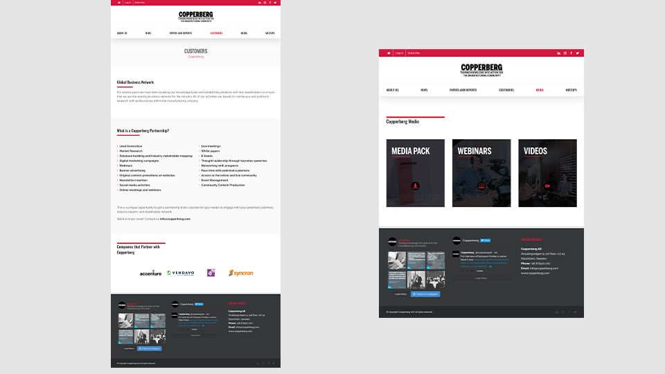
The Customers and Media pages represent the organizations partnership and media offerings. Again this stays in line with the minimal layout and brand identity.
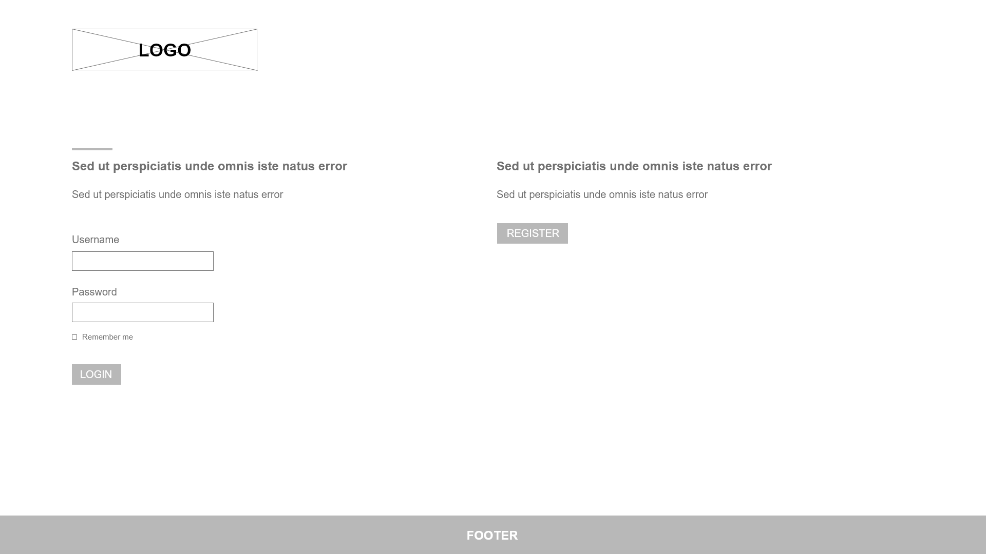
Additional features – Login/Register
Login
Register
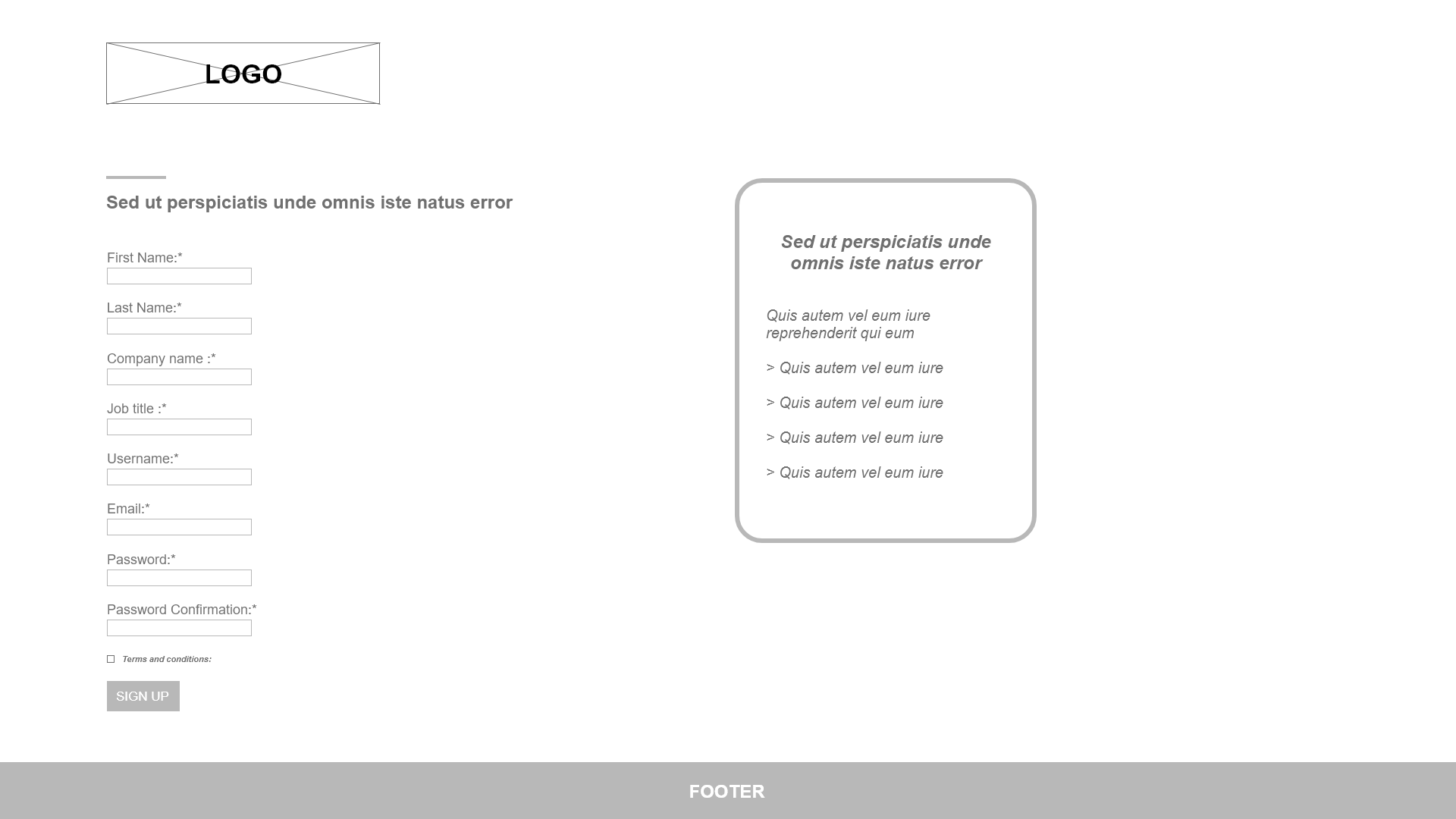
During development it was strategized to create a dedicated membership area which will allow logged in users to gain access to exclusive content. This required me to wireframe two additional pages as can be seen above.
After researching a range of login/sign up pages, I found that given the new brand format keeping it as simple and minimal as possible would work best. I presented the wireframes to the team and we proceeded with the design as seen in the above video.
Web Development
In addition to the UX UI design of the new platform I also built the website feeling that wordpress was the best CMS for staff members who may update the website and post new articles. After assessing the website needs I chose a highly customizable theme coding the CSS and making edits within the PHP where required.
Conclusion
The project was a success receiving sign off and going live in August 2019. Previously I have worked in teams to deliver such outcomes but I gained great experience managing the process, working to deadlines, delivering presentations and adapting changes from the wider management team.


