Raheem Sterling Football App
About Raheem Sterling App
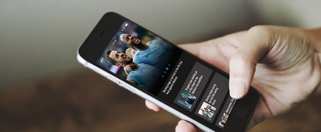
An App for professional footballer Raheem sterling created to increase engagement with fans and provide updates on latest news, about the player in an interactive format.
My role:
Designer
- Sketch
- Illustrator
- Photoshop
Problem
Raheem Sterling is a professional footballer for both Manchester City, the leading club in England and the National team with a social media following of over 5M.
This project has been based on the fact that Raheem, and many footballers have a large social media following to promote them and websites but given the increase of engagement on mobile devices I found that it would be best to promote football and lifestyle in an App format. This would therefore be an effective App template which could be used not only for Raheem, but also utilized for other players which could follow the same structure; in a uniform style.
Current Raheem Sterling Website
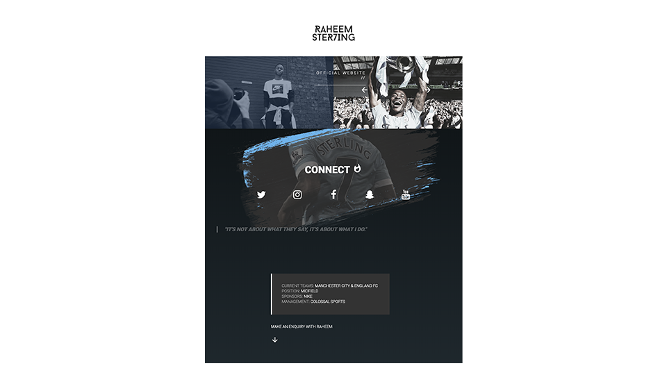
As with many top level footballers their online presence is largely on Twitter and Instagram, often having website which doesn’t largely contribute to their online profile. In this case Raheem sterling has 5million followers on instagram but a website with landing page and no updated content. Therefore a personalized app can provide a perfect middle ground to both with more concise updates than instagram.
User Flow

For this project the main purpose was to create a very efficient user journey throughout the app, as represented above with the objective being that within 2 clicks the user can navigate from Sign in, to their desired destination.
The key things I wanted to achieve was to make sign up as straightforward as possible and streamline club and country sections. to achieve such I wanted to make the sub pages (in blue), be accessed as tabs which sit on the top page so you don’t have to navigate away to view them This will be explained further throughout my analysis.
Overall I feel that for this project a simple user journey will suit a lightweight app such as this one.
User Personas
Based on the researches and user needs, I created three personas for different user cases.


User interviews
I conducted 4 user interviews – with 2 professional footballers and 2 fans in order to gain a further insight into the need, pros and cons of the application.
Pros:
- Great way for fans to stay engaged with their favorite player(s)
- A good method of further promote myself; I currently have a website but an App may work better
- This could be a good way to promote sponsorship opportunities/advertising with partners
- I think my management team would be very interested
- If updated regularly I would enjoy content any content relating to my favorite player
Cons:
- If I have several favorite players I may have too many apps to download
- I may not have time to update
- I already follow them on Instagram
Wireframes
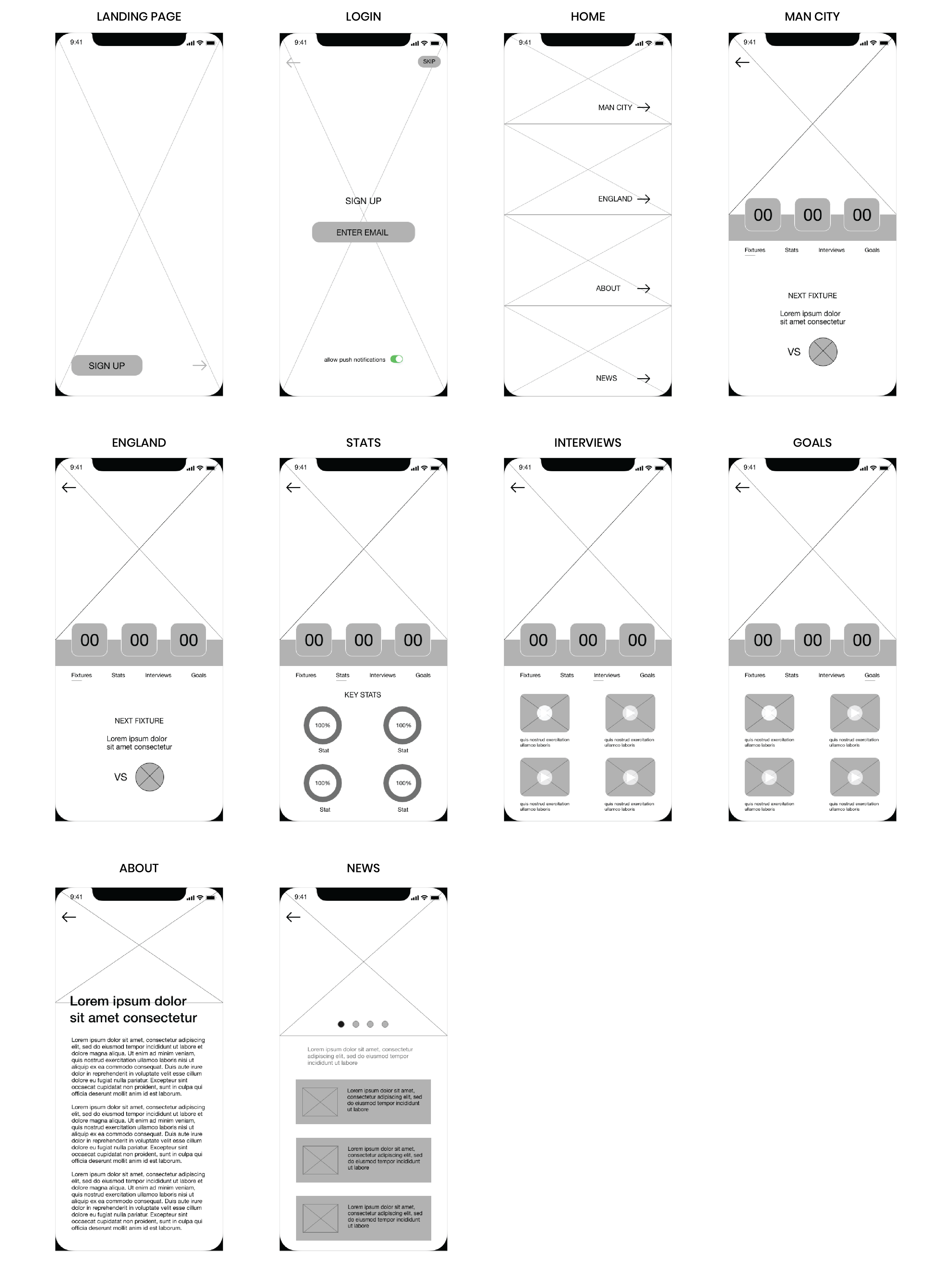
I created lo-fidelity wireframes for this project as presented above.
Initially the Landing screen, familiar to many Apps included a feature image and a CTA to enter. The Register page was framed around a large background feature image and email address CTA to register. Home/Menu is a main feature behind this App, simply containing 4 blocks which fill the screen and navigate into the desired section.
The Man City (Club) and England (Country) screens would contain the same format. within these screens there will also be a set of sub tabs for fixtures, stats, interviews and videos enhancing the user journey as all content would be contained within the top level screen.
About contains a bio on the player and News contains the latest news, with featured and archived content.
App Design
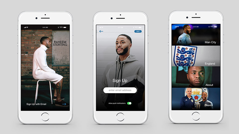
Sign up is always a process for the user which is often required but needs to be as simple as possible. I feel like this has been achieved. From a sales and marketing perspective data is key so the option to add a email address has been provided so that end users can be targeted for email advertising if where necessary but the option to skip is also available.
Once in, users are met with a home screen and moving forward I feel that the order of these sections can be changed dependant on which sections receive most clicks. For all three pages the major focus was on visual appeal and being largely image based.
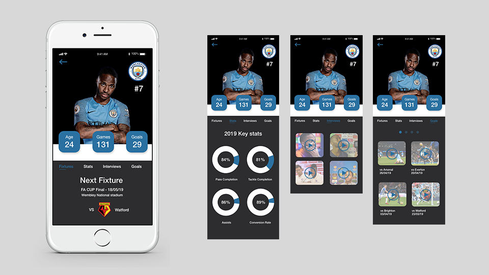
The Man City and England pages are both mirrored in relation to the layout and UI, with different images and content for the relevant sections. For the end user I feel that this will be the focal point of the App, providing player insights, fixtures, video content and statistics.
As mentioned I wanted to avoid taking the user away from this page to view the ‘subpages'(to the right). To avoid doing so having tabs would make the process easier to scroll through and also navigate back to the home screen if required in one click.
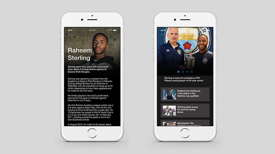
I felt it important to add an interpersonal element to the App with an About and News pages providing information and updates about the player. The UI was kept consistent throughout, and again the UX remained straightforward.
Conclusion
Easy to navigate.. engaging.. Some of the feedback provided from the users I interviewed after showing the final prototype. This is a project idea I have had and I feel that the foundations have provided a great starting point to develop. I enjoy working on Products I have a interest within and I feel the ease of use, in conjunction with visual appeal have made this project work well. I feel that the UI of the home page may be modified in relation to the images used having more consistency, possibly branding them more in a uniform format and adding animations in sections like the statistics and I aim to develop these sections.


